This is the reader companion to the Week 1 deck. The deck is primary: seven live widgets, each one a concept you can push until it breaks. This note follows the deck in order and adds what a slide cannot carry: the derivations, the worked numbers, concept checks and exam questions with model answers. Every number below is printed by workbook.ipynb (numpy, scipy, matplotlib only) and stored in numbers.json; a widget at its default state shows the same number, because it uses the same formula, the same defaults and the same seeded generator.
The scenarios are introduced here on their own terms. Nothing in the week depends on any particular laboratory, dataset or software installation.
1. Crowd disasters are physics, not panic
Across recorded crowd disasters the victims were often not killed by an external hazard but by the crowd itself. At high density, involuntary body contacts transmit forces that add up from body to body; people fall, and a hole in the crowd grows (helbing2015_d0b0 ↗). Words such as "panic" and "stampede" blame visitors and block understanding. A crowd crush (people immobilised) differs from a stampede (sudden uncontrolled movement) (haghani2023_5c35 ↗).
| year | event | killed | injured | as recorded |
|---|---|---|---|---|
| 1989 | Hillsborough, Sheffield | 96 | over 700 | crush inside the pens |
| 1990 | Mina, Saudi Arabia (Hajj) | more than 1,400 | over 1,000 | listed as a stampede |
| 2010 | Love Parade, Duisburg | 21 | over 500 | crush in the queues towards the site |
| 2015 | Hajj, Mecca | more than 2,400 | over 1,000 | |
| 2022 | Itaewon, Seoul | at least 159 casualties | revellers entering from several directions, no crowd management |
Rows as listed by haghani2023_5c35. Two aggregates come from two sources whose counts do not agree, and each is quoted as its source states it: since 1945, more than 30 large crowd panics, more than 1,000 killed, at least 3,400 seriously injured (helbing2005_94a7 ↗); at minimum 11,000 deaths over the last three decades (haghani2023_5c35). The corpus holds no measured peak density for Hillsborough, Mina or Itaewon, so none is quoted.
The question a model is built to answer: given this geometry, these inflows and these routes, where and when does local density become dangerous, and which change reduces it?
Concept check. Why is "panic" a poor explanation for a crush? Answer: it locates the cause in visitors' behaviour, while the mechanism (forces adding up between touching bodies at high density) is set by density and geometry, which a designer can change before the event.
2. What a model is for: layers of defence
Haghani et al. frame crowd safety as five imperfect layers: (a) policy and legislation, (b) pre-planning and risk assessment, (c) operation and control, (d) community preparedness, (e) incident response and impact mitigation. Harm needs the holes of all layers to line up. Computer simulation and sensors act at the planning and operational levels, (b) and (c). The three jobs of a crowd model map onto those layers:
| job | layer | what the model must get right |
|---|---|---|
| safety assessment | (b) planning | where local density becomes dangerous for a given geometry and inflow |
| facility design | (b) planning | how a change (door width, obstacle, route) shifts that density |
| labelled ground truth for sensing | (c) operation | counts and positions that are exact for the simulated crowd, and a crowd that behaves like a real one |
Derivation. Let layer i let a hazard through with probability p_i. If the layers fail independently, the probability that a hazard passes all five is the product P = ∏ p_i. A shared cause (for example no crowd management at all) defeats every layer at once with probability c, so P = c + (1 − c) ∏ p_i.
In words: each layer only has to catch what the one before it missed; the product is small only if the holes are independent.
Worked numbers (SwissCheese; the probabilities are illustrative assumptions, the source paper gives none). Five layers at 0.20: P = 0.20⁵ = 3.2 × 10⁻⁴, about 1 in 3,125. A Monte Carlo of 100,000 seeded trials gives 41 passes against 32.0 expected (Poisson standard deviation about 5.7, so 41 is consistent with the product). With a shared cause c = 0.10, P = 0.1003, 313 times larger, with no layer changed; the Monte Carlo gives 10,067 passes. Lowering one layer to p_a = 0.10 halves the independent P to 1.6 × 10⁻⁴ but moves the shared-cause P only from 0.100288 to 0.100144. Of the 60 hazards the picture draws, none passes without the shared cause and 7 pass with it.
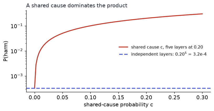
Concept check. Why does lowering one p_i barely help once a shared cause exists? Answer: P is dominated by the c term; the product term is three orders of magnitude smaller.
3. Density: heads per square metre, and bodies that must fit
| quantity | symbol | unit | formula |
|---|---|---|---|
| density | ρ | persons m⁻² | N/A |
| mean spacing on a square grid | s̄ | m | 1/√ρ |
| area coverage | φ | dimensionless | Nπr²/A |
Bodies are not points. With disc radius r the covered fraction is φ = Nπr²/A, and no arrangement fits more than the hexagonal packing. Derivation. In a hexagonal arrangement each disc owns a regular hexagon circumscribing it, of area 2√3 r². So ρ_hex = 1/(2√3 r²) = 2/(√3 (2r)²), and the covered fraction is πr²/(2√3 r²) = π/(2√3) = 0.907. This is plane geometry and needs no citation.
In words: density counts heads per square metre; spacing is the gap you would get on a square grid; coverage is how much floor is body.
Worked numbers (DensityBox, r = 0.20 m, a 0.40 m body; Week 2's single-file body length ℓ is 0.36 m, Seyfried's value, and its stop-and-go band is drawn for an assumed r = 0.25 m). N = 20 on A = 20 m²: ρ = 1.00 m⁻², spacing 1.00 m, φ = 0.126, all 20 placed. ρ_hex = 7.22 m⁻² for r = 0.20 m, 4.62 for r = 0.25 m, 3.21 for r = 0.30 m. Break it: N = 60 on A = 8 m² gives ρ = 7.5 and φ = 0.942, above both bounds; random sequential placement (discs arrive at random positions, up to 4,000 tries each, seed 7) fits 31 and leaves 29 at the door.
The literature gives the scale: an equivalent diameter of a person is 50 to 70 cm, observed maximal packing is 5 to 6 persons m⁻² (5.4 commonly used), and cellular automata use 0.40 m cells, i.e. 6.25 persons m⁻² (maury2018_d24a ↗). Stop-and-go waves tend to appear beyond 2 to 4 persons m⁻² and crowd turbulence above 4 to 7, depending on body diameter (helbing2015_d0b0); in Moussaid's model stop-and-go occurs at 40 to 65 percent spatial coverage (moussad2011_fa42 ↗).
Where random placement jams. The corpus is silent on random sequential placement, so this is a workbook measurement of this toy. On A = 10 m² with r = 0.20 m and seed 7 the first person who does not fit is number 39, at φ = 0.478 of the placed discs. Over seeds 1 to 20 the coverage of the placed discs at the first failure is 0.483 (sd 0.021), about half of the hexagonal 0.907. It is a coverage number, so it is nearly the same for larger bodies (0.468 for r = 0.25 m and r = 0.30 m) and therefore arrives at a lower density: 3.85, 2.39 and 1.66 persons m⁻² for r = 0.20, 0.25 and 0.30 m. Density alone does not say how full a room is; body size does.
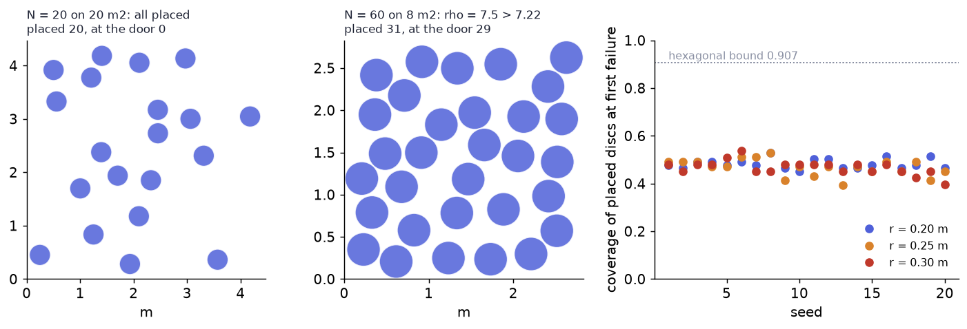
Concept check. A hall has ρ = 2.0 m⁻². Can you say whether it is full? Answer: not without the body size; the same ρ is 25 percent coverage for r = 0.20 m and 57 percent for r = 0.30 m (φ = ρπr²).
4. Local versus global: the average that hides a crush
A density needs an area, and the answer depends on which area. Corbetta et al. describe crowds at several scales (submicroscopic, microscopic, mesoscopic, macroscopic, supermacroscopic), and a continuum density field is meaningful only over an area holding enough people (corbetta2023_bcb7 ↗). Hillsborough's crush happened inside the pens (haghani2023_5c35), not across the stadium.
Scenario (LocalDensityProbe): a 20 × 15 m forecourt (300 m²) with a 4 × 4 m pen (16 m²) against the south wall next to a gate. 200 people, 30 percent of them in the pen, the rest uniformly random outside. A probe circle of radius R counts the people whose centre lies inside it: ρ_probe = n_R/(πR²).
In words: the venue average spreads the pen's people over the whole forecourt; a crush is a local number.
Worked numbers. ρ_global = 200/300 = 0.67 m⁻². ρ_pen = 60/16 = 3.75 m⁻², 5.6 times the venue value. One of the 60 does not fit and waits at the gate (the 59 placed discs cover 0.46 of the pen, close to where random placement jams, see section 3). A probe of R = 1.50 m at the pen centre counts 31 people in 7.07 m², 4.39 m⁻²: even inside the pen the local reading differs from the pen average. Break one: at R = 0.30 m (0.28 m²) one person reads 3.54 m⁻²; along a scan of 81 positions across the pen the reading is 0 at 12, one person at 51 and two or more at 18. A measurement smaller than a body reports a count, not a density. Break two: f = 0.8 at N = 400 asks the pen to hold 320 people (nominal 20 m⁻²), 60 fit and 260 wait at the gate, and the venue average still reads 1.33 m⁻². Week 6 compares measurement methods; here only the trap is named.

Concept check. Why should a measurement area be larger than one body? Answer: below that size the count is 0 or 1 and the reading jumps between 0 and 1/(πR²) as a person crosses the edge; it measures one body, not a crowd.
5. Speed and flow: why you cannot multiply the extremes
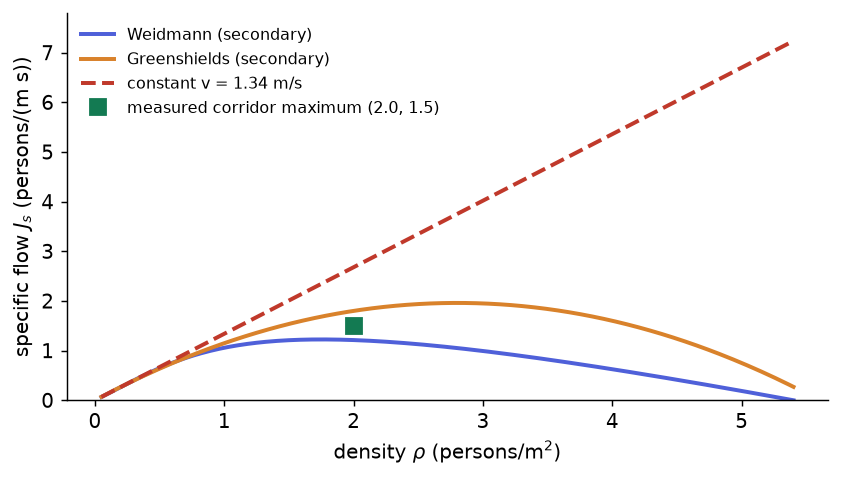
Speed v (m s⁻¹), specific flow J_s = ρv (persons per metre of width per second) and flow J = J_s b (persons per second) through a cross-section of width b. If everyone walked at one constant speed, the flux would grow linearly with density up to capacity; it is speed fluctuations and repulsive encounters that bend it into a maximum at an optimal density (corbetta2023_bcb7). Two empirical speed laws reach the course through secondary sources:
- Weidmann: v = 1.34 (1 − exp(−1.913 (1/ρ − 1/5.4))), quoted in maury2018_d24a; Weidmann's handbook is not in the corpus.
- Greenshields: v = v_f (1 − ρ/ρ_j) with free speed v_f = 1.4 m/s and jam density ρ_j = 5.6 m⁻². The source gives the linear form with slope B = v_f/ρ_j = 0.25 m³/s, quoted from Pushkarev and Zupan in hughes2002_57b4 ↗; neither original is in the corpus.
Derivation of the Greenshields peak. J_s(ρ) = ρ v_f (1 − ρ/ρ_j). Setting dJ_s/dρ = v_f (1 − 2ρ/ρ_j) = 0 gives ρ = ρ_j/2 = 2.8 m⁻² and J_s = v_f ρ_j/4 = 1.96 m⁻¹s⁻¹; speed reaches zero at the jam density ρ_j = 5.6 m⁻². A measured bidirectional corridor reaches a maximum specific flow of 1.5 m⁻¹s⁻¹ at 2.0 m⁻² (zhang2012_ab8c ↗).
In words: flow is how many people cross a line each second; it needs both people and speed, and crowding takes the speed away.
Worked numbers (DensitySpeedFlow). Weidmann at ρ = 1.00 m⁻²: v = 1.058 m/s, J_s = 1.058 m⁻¹s⁻¹, and in a corridor b = 2.0 m, J = 2.12 s⁻¹. The Weidmann J_s peaks at 1.225 (printed 1.22) at ρ = 1.75 m⁻², where v = 0.70 m/s; at ρ = 0.5, 2, 3, 4, 5 the speed is 1.298, 0.606, 0.331, 0.156 and 0.037 m/s. Break it: the constant law v = 1.34 m/s gives J_s = 5.4 × 1.34 = 7.236 at ρ = 5.4, 4.8 times the measured maximum of 1.5 and 3.7 times the Greenshields peak of 1.96. Speed must depend on density. Week 2 derives the curve from one walking rule.
| quantity | symbol | unit | scene at the widget defaults |
|---|---|---|---|
| density | ρ | m⁻² | 20 / 20 = 1.00 |
| mean spacing | s̄ | m | 1.00 |
| coverage | φ | 0.126 | |
| speed | v | m/s | 1.058 (Weidmann, ρ = 1) |
| specific flow | J_s | m⁻¹s⁻¹ | 1.058 |
| flow | J | s⁻¹ | 1.058 × 2.0 = 2.12 |
Concept check. A designer multiplies the jam density 5.4 m⁻² by the free speed 1.34 m/s. What is wrong? Answer: the two extremes never occur together; at 5.4 m⁻² the speed is zero, and the product 7.24 exceeds the measured maximum (1.5), the Greenshields peak (1.96) and the Weidmann peak (1.225) by factors of 4.8, 3.7 and 5.9.
6. Danger beyond density: crowd pressure, and what it misses
Helbing et al. defined crowd pressure as the local density times the local variance of speed, P = ρ Var(v) (definition as given in moussad2011_fa42 and bahamid2026_a88a ↗; local speed there uses a Gaussian weight with R = 0.7 m). In the Mecca video analysis the accident began about ten minutes after turbulent motion with P above 0.02 s⁻², as reported by ramesh2013_9aee ↗ and bahamid2026_a88a. The primary 2007 paper is not in the corpus, so the threshold is secondary. The Gaussian weight is not extractable as an equation; the widget uses a top-hat circle of radius R and says so.
Estimator (CrowdPressure). n_R people lie in the window; ρ_R = n_R/(πR²); Var(v) is the sample variance (denominator n_R − 1) of their speeds; P = ρ_R Var(v). It is undefined for fewer than two people. If speeds are drawn with spread σ_v the expected value is about ρσ_v². People stand on a jittered lattice, because random placement cannot reach the densities this indicator is about (section 3).
In words: pressure here means packed and jostling: many people whose speeds disagree.
Worked numbers. Defaults ρ = 3.0 m⁻², u = 0.50 m/s, σ_v = 0.10 m/s, R = 0.7 m, seed 13: n_R = 4, ρ_R = 2.60 m⁻², Var(v) = 0.0155 m²/s², P = 0.0402 s⁻², against the expected 3.0 × 0.10² = 0.030. The estimate is noisy because the window is small: over seeds 1 to 50 at R = 1.5 m (about 21 people) P has mean 0.032 and sd 0.010; at R = 0.4 m (about 1.6 people) P is undefined in 16 of 50 seeds and, where defined, ranges from 0.0005 to 0.185 (sd 0.045). Break one: a standing crush at ρ = 7.0 m⁻², u = 0, σ_v = 0 puts 12 people in the R = 0.7 m window (ρ_R = 7.8 m⁻²) and P = 0 exactly, calm by the indicator; the same density with u = 0.5 and σ_v = 0.1 gives P = 0.088.
The indicator rewards disorder, not packing. A fully immobilised crowd, which is what a crush is (haghani2023_5c35), has zero speed variance.
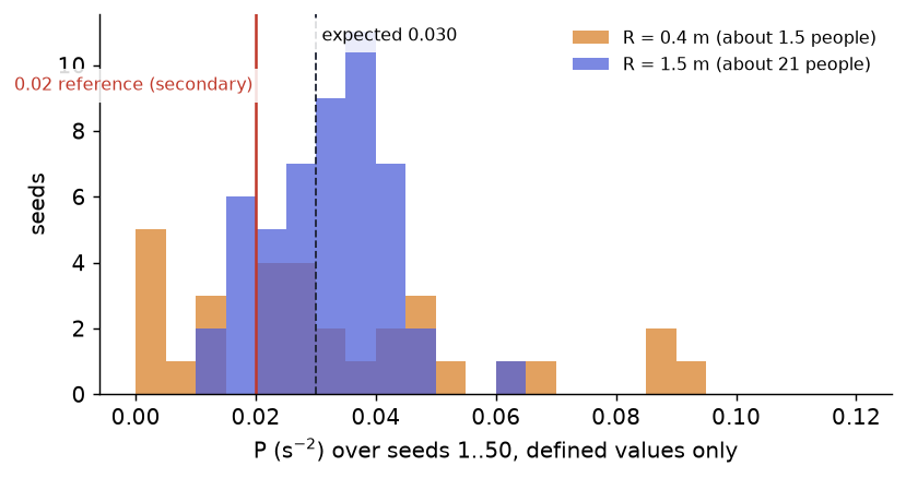
Concept check. Why does P jump when R shrinks to 0.40 m? Answer: at ρ = 3 the window holds 1.5 people on average, so the variance comes from one or two speeds; at ρ = 7 it holds about 3.5 to 4.
7. Job one and two: sizing an exit, and the design surprise
To clear N people through an exit in a clearance time t_c needs a width b = N/(J_s t_c), where J_s is a measured or modelled capacity and never the product of jam density and free speed. (The letter T is kept for the time gap of Week 2.)
In words: the door must pass N people in t_c seconds at the rate each metre of door can carry.
Worked numbers (ExitSizer), N = 1,000, t_c = 5 min = 300 s:
| specific flow J_s | source | width b | bodies of 0.40 m abreast |
|---|---|---|---|
| 1.50 | measured corridor maximum (zhang2012_ab8c) | 2.22 m | 5 |
| 1.96 | Greenshields peak (hughes2002_57b4) | 1.70 m | 4 |
| 1.225 | Weidmann peak, computed from the formula in maury2018_d24a | 2.72 m | 6 |
| 7.236 | jam density × free speed | 0.46 m | 1 |
The naive product under-sizes the exit by 4.8 times against the measured maximum and 3.7 times against the Greenshields peak.

Facility design can also yield counter-intuitive fixes. In a panic-like experiment with an 82 cm door, a 45 cm board in front of the exit reduced clogging and raised outflow by about 30 percent, while under normal leaving outflows with and without pillars were about the same (helbing2005_94a7; the table behind the 30 percent figure could not be extracted, so only the text is quoted). Maury and Faure report that the effect is not robust: 4 percent in Yanagisawa et al. (0.5 m exit) and about 16 percent in Jiang et al. (2.5 to 2.9 persons per second through a 1 m exit, three runs, no confidence interval possible) (maury2018_d24a). Same idea, three experiments, three answers. Design claims need both a model and a measurement, which is why the course tests every model against data (Week 8 returns to clogging).
Concept check. Why can three runs not give a confidence interval for a 16 percent gain? Answer: the spread between runs is estimated from three values, far too few to bound the mean with useful confidence.
8. Job three: a simulated crowd as labelled ground truth
Labels for sensing are expensive: annotating one image of about 500 people takes 30 to 40 minutes, and synthetic scenes differ from reality by a domain gap that costs accuracy on transfer (gao2021_0a0a ↗). A simulation produces counts, density maps and positions with every frame, aligned across sensors and replayable (jia2025_1dde ↗). The label is exact about the simulated crowd and only as trustworthy as the model of people behind it.
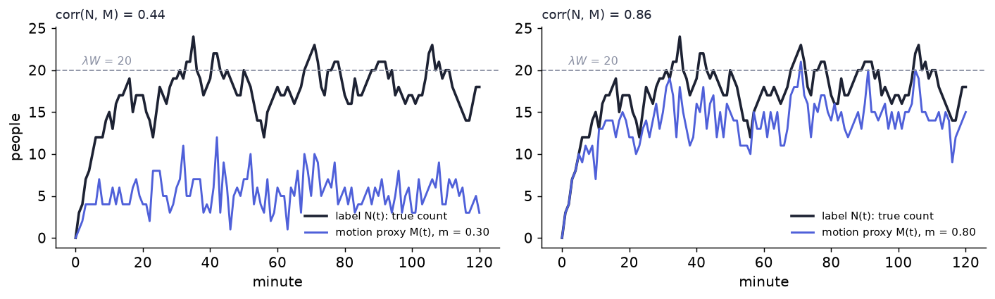
Scenario (LabelsFromSimulation): a 10 × 8 m reading room, 120 minutes, empty at the start, one door. Arrivals at rate λ per minute (exponential gaps −ln(u)/λ), stays with mean W minutes (−W ln u), and in every minute a present person is walking with probability m. The label N(j) is the true count at minute j; the motion proxy M(j) is the number walking. In a room with arrivals at rate λ and mean stay W the mean occupancy is L = λW (Little's law, wartelle2026_8b5e ↗).
In words: the simulation hands you the true count at every instant; a motion sensor sees only the part of the crowd that moves.
Worked numbers. λ = 2.0 min⁻¹ and W = 10 min give L = 20; the seeded run has 219 arrivals, a run mean of 17.2 (below 20 because the room starts empty; the second half averages 18.4), and a maximum of 24. At t = 60 min the label is 18 people and 6 are walking (m = 0.30). corr(N, M) = 0.44 at m = 0.30 and 0.86 at m = 0.80. Break it: at m = 0 everyone is seated, the proxy is flat at zero while the label climbs to about 20, and the correlation cannot be computed (the deck prints "undefined: the proxy never changes"). A sensor that responds to motion sees the walking share, not the head count. Weeks 10 and 11 build this properly.
Concept check. Two rooms have the same mean count L = 20. Can a motion sensor tell them apart? Answer: not from the mean; only from how the walking share and the count vary, which is what Weeks 10 and 11 examine.
9. How a model earns trust, and the map of the course
Calibration is optimisation: choose the parameters that bring the simulation closest to the reference data, p_opt = argmin_p dist(sim(p), reference) (wolinski2014_f409 ↗, their Equation 5). Reference data are microscopic (trajectories) or macroscopic (aggregates). wolinski2014_f409 names absolute difference, path length, inter-pedestrian distance and progressive difference on the microscopic side and vorticity and the fundamental diagram on the macroscopic side. One metric cannot cover both: a model can pass a macroscopic check and fail a microscopic one, so use several (zhong2022_7cb2 ↗).
In words: choose the parameters that bring the simulation closest to reference data, and judge closeness in more than one way.
The throughline of the course: a crowd model is a hypothesis about people, and a hypothesis is only as good as the measurement that could refute it. Weeks 2 to 5 build models, Week 6 measures, Weeks 7 to 9 cover geometry, bottlenecks and evacuation, Weeks 10 and 11 occupancy and sensors, Week 12 validation. Widgets return as follows: DensitySpeedFlow in Weeks 2 and 5, DensityBox and LocalDensityProbe in Week 6, ExitSizer and CrowdPressure in Week 8, LabelsFromSimulation in Weeks 10 and 11, calibration in Week 12.
Exam questions with model answers
1. A forecourt of 300 m² holds 200 people, 60 of them in a 16 m² pen. Compute the venue density and the pen density and say which one matters for safety. Answer. Venue: 200/300 = 0.67 m⁻². Pen: 60/16 = 3.75 m⁻², 5.6 times larger. The pen value matters: it is inside the 2 to 4 m⁻² range where stop-and-go waves tend to appear, while the venue average is far below it. The average spreads the pen's people over floor they are not standing on.
2. 1,200 people must leave a hall through one exit in 4 minutes, and you use the measured corridor maximum of 1.5 persons m⁻¹s⁻¹. How wide must the exit be, and what happens if you use jam density times free speed instead? Answer. b = N/(J_s t_c) = 1,200/(1.5 × 240) = 3.33 m. With 5.4 × 1.34 = 7.236 the width is 1,200/(7.236 × 240) = 0.69 m, a factor of 4.8 too small, because jam density and free speed never occur together.
3. A crowd-pressure indicator reads exactly zero in a packed hall. Give two different situations that produce this and say what the reading does not tell you. Answer. A standing crush in which nobody moves (all speeds zero, so the variance is zero) and a packed crowd moving in perfect lockstep (equal speeds). P = ρ Var(v) measures disorder in speed, not packing; the first case is the most dangerous state and reads calm. A small window can also give an unstable variance from one or two people.
4. In a five-layer defence model every layer has hole probability 0.20. Compute the harm probability if the layers fail independently, and if a shared cause with probability 0.10 exists. What does the result say about improving one layer? Answer. Independent: 0.20⁵ = 3.2 × 10⁻⁴ (1 in 3,125). With the shared cause: 0.10 + 0.90 × 3.2 × 10⁻⁴ = 0.1003, 313 times larger. Improving one layer barely changes the second value (p_a = 0.10 moves it from 0.100288 to 0.100144); the shared cause has to be removed. The probabilities are assumptions for illustration.
5. Random placement of 0.40 m bodies on a 10 m² floor first fails to seat everyone at about 0.48 coverage, while the hexagonal bound is 0.907. Explain the gap and why a larger body jams at a lower density. Answer. Random sequential placement leaves gaps too small for another disc, whereas the hexagonal arrangement is a perfectly ordered packing. The jamming is set by coverage, φ = ρπr², so for a larger r the same φ is reached at a lower ρ (3.85, 2.39 and 1.66 m⁻² for r = 0.20, 0.25, 0.30 m). This is a measurement on a toy; the corpus is silent on random sequential placement.
6. Why can a simulated crowd stand in for hand-labelled data, and what limits the swap? Answer. It yields exact counts, density maps and positions at every frame, aligned across sensors and replayable, without annotation effort. The label is exact only about the simulated crowd; the domain gap between synthetic and real scenes and the realism of the behaviour model limit what a sensor trained on it can do. A motion-based sensor also sees only the walking share (correlation with the count 0.44 at m = 0.30).
Where the corpus is silent
- The primary crowd-pressure paper (Helbing, Johansson and Al-Abideen 2007, Mecca video analysis) is not in the corpus; the 0.02 s⁻² threshold reaches the week through ramesh2013_9aee and bahamid2026_a88a, the definition through moussad2011_fa42. It is labelled secondary.
- The Gaussian distance weight (R = 0.7 m) is referenced but not extractable as an equation; the widget uses a top-hat circle.
- Weidmann's handbook, Greenshields and Pushkarev and Zupan are not in the corpus; their constants come from maury2018_d24a and hughes2002_57b4.
- The corpus holds no measured peak densities for the listed disasters.
- No random sequential adsorption (jamming coverage) reference was found; the coverage at failure is a measurement of this toy.
- haghani2023_5c35 gives no failure probabilities for the layers; all probabilities are assumptions.
- The table of flows through the 82 cm door with and without the board is not extractable; only the text's "about 30 percent" is quoted.
- There is no primary source in the corpus for Fruin's level of service; the week does not use level-of-service grades.
Further reading
- haghani2023_5c35 ↗: the layers of crowd safety and the event list.
- helbing2015_d0b0 ↗: the force-chain mechanism and density bands.
- helbing2005_94a7 ↗: crowd panics, clogging and design solutions.
- corbetta2023_bcb7 ↗: scales of description and the flux-density relation.
- maury2018_d24a ↗: packing, the Weidmann law and the obstacle caveat.
- duives2013_3924 ↗: a survey of the model families the next weeks build.
- wu2022_7ccd ↗: optional; a desired-speed distribution (secondary).
Provenance (instructor only)
This week quotes no first-party (laboratory) number. Every worked number comes from the executed workbook or from the literature cited inline. Vault paths:
- edu/courses/CRD503-crowd-dynamics-simulation/CRD503 Curriculum.md
- edu/courses/CRD503-crowd-dynamics-simulation/week-01-why-model-crowds-from-disasters/workbook.ipynb
- edu/courses/CRD503-crowd-dynamics-simulation/week-01-why-model-crowds-from-disasters/numbers.json